design

Dewey Designs to Share

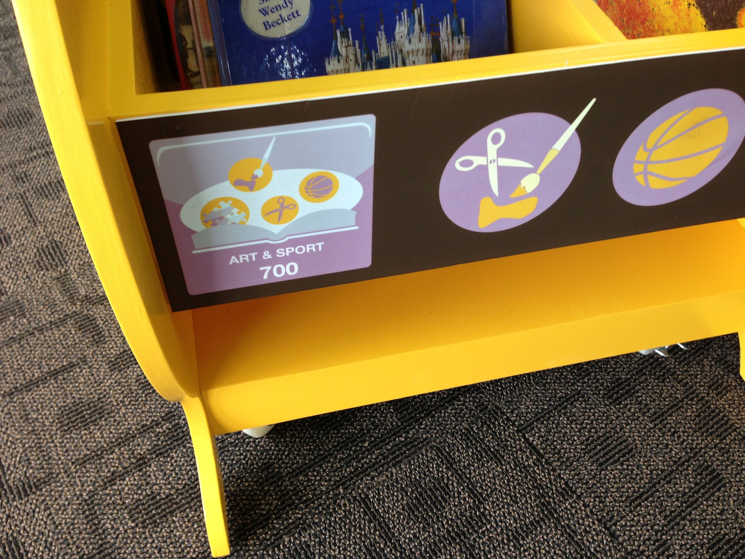
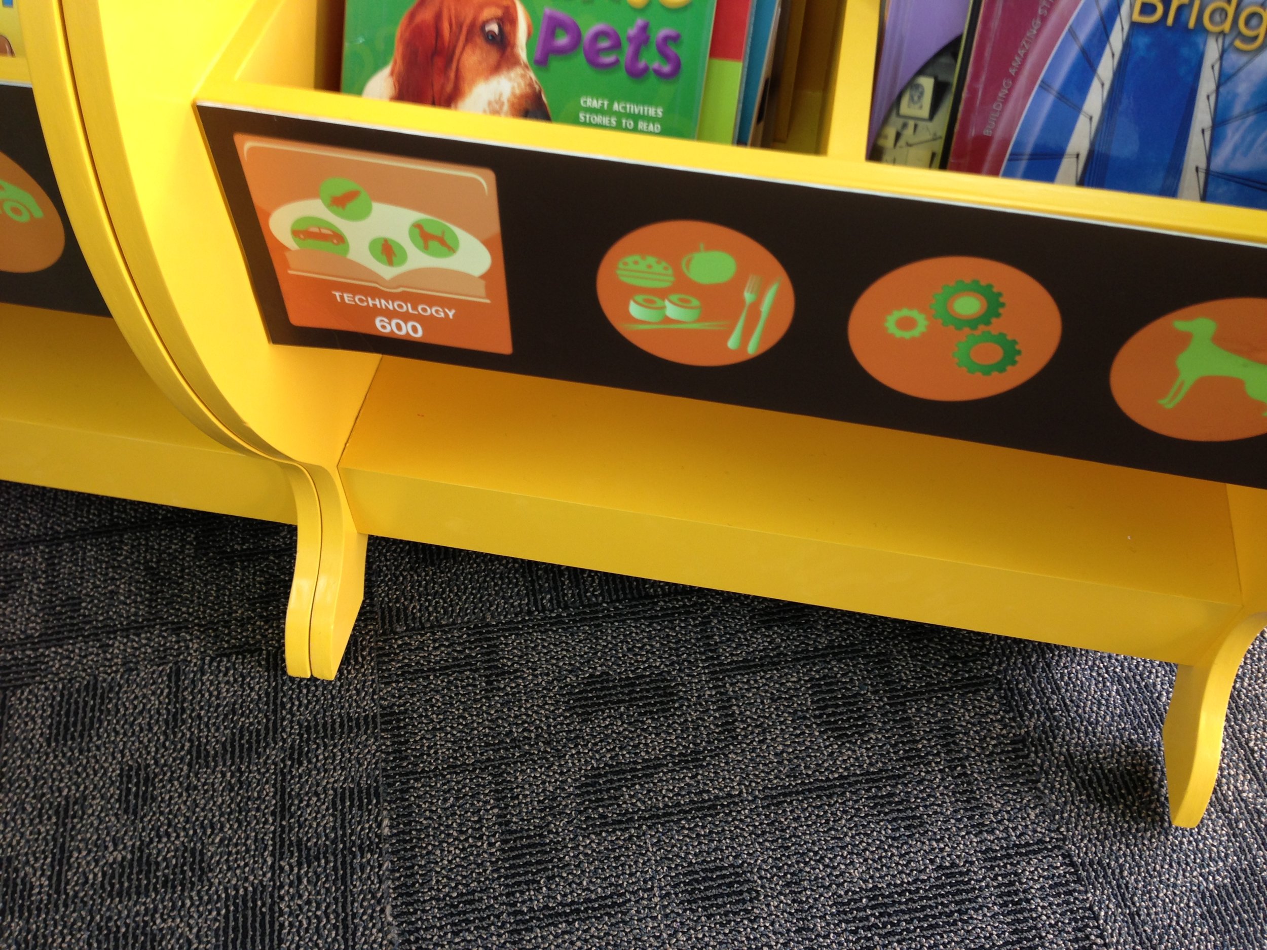
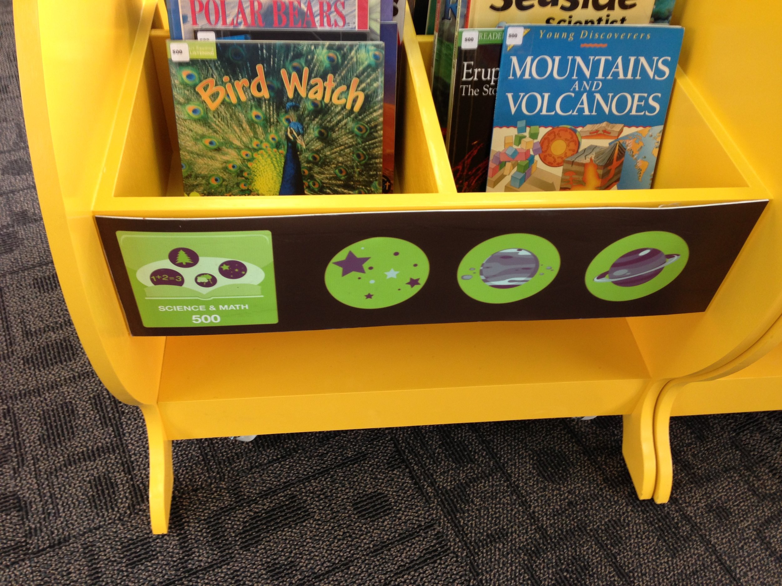
Six years ago I asked my daughter, Maggie Appleton, to help me create some Dewey Decimal System signs for the libraries on our new school campus, the permanent home of United World College of SE Asia (UWCSEA) - East campus, in Tampines, Singapore.  At the time she was an IB Art student at the original UWCSEA campus -- now known as UWCSEA Dover.

maggie uwcsea east dewey.png

She didn't come up with them completely on her own.  I'd been searching the web for different Dewey designs and had found this retro design one I liked on Flickr by Susanna Ryan.

Screenshot 2016-08-30 21.52.35.png

But it was fairly monochrome and I envisaged associating different colors with different sections, much like the famous colored layout of rooms at Powells Books in Portland, Oregon (see colored section sign to the right). 

So Maggie got permission from Susanna to modify her icons and to change the colors.

Over the years people have asked Maggie for permission to use her designs -- and, so finally, in a creative commons way (in line with how Susanna allowed to build upon her original design) -- click here to access a DROPBOX folder of all her files.

--------------------------------------------------------------

My good friend and colleague Barb Philip Reid also has a talented graphic designer (step) daughter -- Natasha Potzsch.   And she asked her for a similar favor (to be a signage servant!). Natasha's Dewey designs are also freely available to all teacher-librarians -- click here to access a GOOGLE folder of her files.

DEWEY_POSTER_CMYK_PRINT_READY - SMALLER.png

We've both been meaning to share these more widely.  So now -- go have fun.  Our daughters are pleased to have librarians use them!  (And obviously let us know if any links don't work....)

Carol Kuhlthau meets Tim Brown: Guided Inquiry {Design} Thinking

Two books have been guiding my thinking about research & inquiry cycles for the past couple of years.
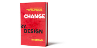
a)  Change by Design -- by Tim Brown, of IDEO "design thinking" fame.  His framework is not explicitly educational, though IDEO have published a toolkit of design thinking for educators.


b)  Guided Inquiry Design: a framework for Inquiry in your School -- by Carol C. Kuhlthau, Leslie K. Maniotes, and Ann K. Caspari.  Kuhlthau is the grand dame of teacher-librarianship and the one who first recognized the emotional element involved in the ISP (Information Search Process) back in 1991.

For me, the most important feature they share is the recognition of that emotional element in research.  We all get discouraged - or should.  If you don't experience any dip in confidence, then it means you're not really pushing yourself in terms of researching.   Tim's sketch illustrates Carol's original insight very well.
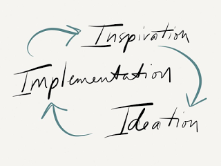
Tim's design process is an incredibly simple iterative cycle between Inspiration, Ideation, and Implementation (below is my sketch) -- but I think it works just as well in terms of research.

Carol's latest framework is more expansive, incorporating 8 "verb" steps (mirroring her older ISP "noun" stages - shown in parentheses) :
  • Open (Initiation)
    • Invitation to inquiry
    • Open minds
    • Stimulate curiosity
  • Immerse (Selection)
    • Build background knowledge
    • Connect to content
    • Discover interesting ideas
  • Explore (Exploration)
    • Explore interesting ideas
    • Look around
    • Dip in
  • Identify (Formulation)
    • Pause and ponder
    • Identify inquiry questions
    • Decide direction
  • Gather (Collection)
    • Gather important information
    • Go broad
    • Go deep
  • Create (Presentation)
    • Reflect on learning
    • Go beyond facts to make meaning
    • Create to communicate
  • Share (Presentation)
    • Learn from each other
    • Sharing learning
    • Tell your story
  • Evaluate (Assessment)
    • Evaluate achievement of learning goals
    • Reflect on content
    • Reflect on process

Carol's book offers plenty of practical suggestions for implementing inquiry in schools, e.g., she stresses the need for an Inquiry Journal (a workspace for individual composing and reflection) as well as Inquiry Charts (attempts to visualize ideas, connections, questions, etc.) and an Inquiry Log (a record of sources consulted), but one of the most important points she makes is the crucial distinction between the Explore and the Gather stages.

The Explore stage is about browsing, scanning, and skimming.  "Dipping in" means you need to relax, read, and reflect.  Sources should just be tracked in the Inquiry Log at this point.

The Gather stage is about detailed note-taking, comprehensive searching, and "going deep".  This is also the stage when you need to thinking about citing, quoting, and paraphrasing. Too often students think they have to take detailed notes on a source the first time they encounter it - before they have decided on an inquiry focus.

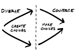
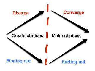
Again, Tim has a simple distinction which I think epitomizes the difference.

Here I have added just two extra descriptions:  Finding Out vs. Sorting Out (a la Kath Murdoch)
When talking to students, I now like to have them clarify which mode they think they are currently in.  And the emotional dip of uncertainty is often a sign that's time for the shift.  What a metacognitive skill -- to know how much first stage searching is enough to work with -- to have enough choices.

This is Carol's Identify stage -- which is about focusing and establishing a meaningful inquiry question -- when the thinking shifts from divergent (broad) to convergent (deep).

Tim Brown insists all ideas (i.e., research questions) must be analyzed in light of three criteria:  Desirability (personal interest/passion), Viability (for Tim this means "makes business sense," but in the educational realm it translates to "fits the assignment or criteria" and satisfies the big "so what?"), and Feasibility (the time and resources to actually complete the project).
Similarly, Carol asks students to consider their question in terms of the assigned task, their own interest, the time available, and the information and resources available.

I think Tim's four basic illustrations concisely convey the key stages of research better than Carol's more elaborate theory.  I still want her book on my shelf, but, until I can get more teachers to read and absorb it, I'll be using Tim's ideas and images in conversation.

OUT OF THE DRAFTS FOLDER: (2009) An Injection of Ideas on Library Design

How many draft blog posts do you have sitting around?  Here is one from two years ago -- on library design.  I never got around to publishing it, so am doing so now - with the intent of posting a recent update of thoughts and resources, especially after hearing of a recent Kevin Hennah consultation in Kuala Lumpur with international school librarians.


On August 22nd [2009] about 30 international school librarians from around Asia gathered at ISB in Bangkok for a one-day workshop on library design by Kevin Hennah, a retail merchandising consultant and designer who has done a lot of work with libraries in Australia.
(While he seems to have worked with many major companies, it was this advertising campaign in his portfolio that made the biggest visual impression on me: Australia Post: If you really want to touch someone, send them a letter. I should also mention his featured section in the Australian book, Rethink! Ideas for Inspiring School Library Design -- and I think he said he's working on a book with Opening the Book in the UK. )

The success of the workshop can be summed up by Barb Philip's comment as she walked out: "I feel like taking a sledgehammer to my library."

What did he say? Well, others who attended the workshop have been much more efficient in sharing about it online. Within 24 hours Kim Cofino, one of the event organizers, had blogged about it and Tara Ethridge, the other event organizer, blogged about it on Monday the 24th. Anthony Tilke posted information about it on the ECIS iSkoodle forum for librarians (registration required to view), and Beth Gourley made public her Evernote notebook on Library as Space and Place, which includes her notes on Kevin's presentation.

What can I add? A few extension links, perhaps...

Kevin's value was in his slideshow presentation -- talk about visual learning! We saw over 600 images, illustrating retail principles in practice in libraries. He talked us through before-and-after shots, good examples, bad examples, interesting examples. (And, no, for copyright reasons, he said he couldn't give us copies of his presentation.)

As Kevin spoke, I kept scribbling down the names of the libraries being shown (mainly Australian and more public than school ones) -- see the list of libraries here. I tried to find images of them on the internet, without much success -- except for The Idea Stores in London (UK), e.g., search of Flickr for "idea store" and "library".

Instead you might have a look at some of these libraries:
I was familiar with the retail design approaches in libraries -- as Paco Underhill's book "Why We Buy: The Science of Shopping" became popular with librarians in the US several years ago, e.g., see the Library Journal article "Power Users - Designing buildings and services from the end user's viewpoint transforms access for everyone" [2005], as well as "What libraries can learn from bookstores: Applying bookstore design to public libraries " [2003]. But it's always good to have it re-iterated.

He recommends a "What's Hot?" display (see how Barb went back and immediately put that up on the wall in her library).

Kevin is all for ditching Dewey and using more user-friendly, bookstore-type categories to organize books. He cited the Palmerston Public Library (NT, Australia) as an example of a library choosing to organize the collection in terms of 17 "living rooms" or categories (read this 2006 white paper "Where's the Dewey?" for background on the process they went through).

Similar attempts:
The National Library of Singapore has its own variation on re-grouping Dewey, supposedly to help the public find books, but I find it confusing -- as the catalog just gives me the Dewey number - so I have to wander to find the section that Dewey number is stored in.


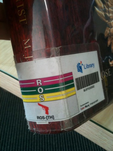
One thing I do like about the NLB shelves is the use of ColorMarq, a library shelf ID system where each letter of the alphabet has a different color.  It makes it easy to see when a book is mis-shelved.  (I do have a problem when NLB shelvers only bother to sort by the first three letters of the authors' names.... especially in areas like BRO or WIL.)

[Photos by me]

Inspiring Libraries

Libraries are a natural source of inspiration for the curious and creative.

Listening to Paul Holdengraber, the Director of the New York Public Library's Public Program Series, is an inspiration in itself. Here are my notes on an interview filmed with him in 2007.
His job is to "oxygenate" the New York Public Library -- to make the famous lions outside "roar" -- to create a library without walls.
We need to make people think it's sexy to think -- that there should be both information and inspiration. We have to free the books. To have a thought is to caress our brains. Thinking is exciting!

Inspiration comes mainly from arguments around the kitchen table. We need each other desperately as humans (e.g., you can't tickle yourself). A library is a space of conviviality -- which can help us get references in common. We all need something to talk about.

Curiosity is one of the most important things we can arm ourselves with in life -- if we're not curious at 20, we'll be boring at 50. We must inspire curiosity -- to be interested in the world -- to have interests -- something to replenish our minds.
The blog Design*Sponge has done a couple of videos showing how a librarian at the New York Public Library has inspired five different artists -- a glassblower, a letterpress printer, a maker of ceramic dishes, etc. -- with material from the library's collection, whether images in books or artifacts themselves -- maps, old postcards, prints, etc. See the videos on the NYPL webpage: Design by the Book.

Similarly, Jay Walker is a man who believes a library should have objects to inspire -- as well as books. There is a 7-minute TED video of him showing off some of the treasures in his amazing private library: Jay Walker: A library of human imagination -- including an Enigma machine, a flag that's been to the moon and back, and a real Sputnik satellite.

Wired did an article on his library not long ago -- Browse the Artifacts of Geek History in Jay Walker's Library - with plenty of photos. Go check it out.

I'm going to end with a plug for the book I think should be in every library -- as a source of inspiration: Alan Fletcher's The Art of Looking Sideways (2001), which has been described as "the ultimate guide to visual awareness, a magical compilation that will entertain and inspire all those who enjoy the interplay between word and image, and who relish the odd and the unexpected. "

Fletcher, a famous British graphic designer, is now dead, but here's a YouTube video of him talking about his unusual book.


Flickr photo credits: lion: MacRonin47; library: jamesjk ; Jay Walker library